


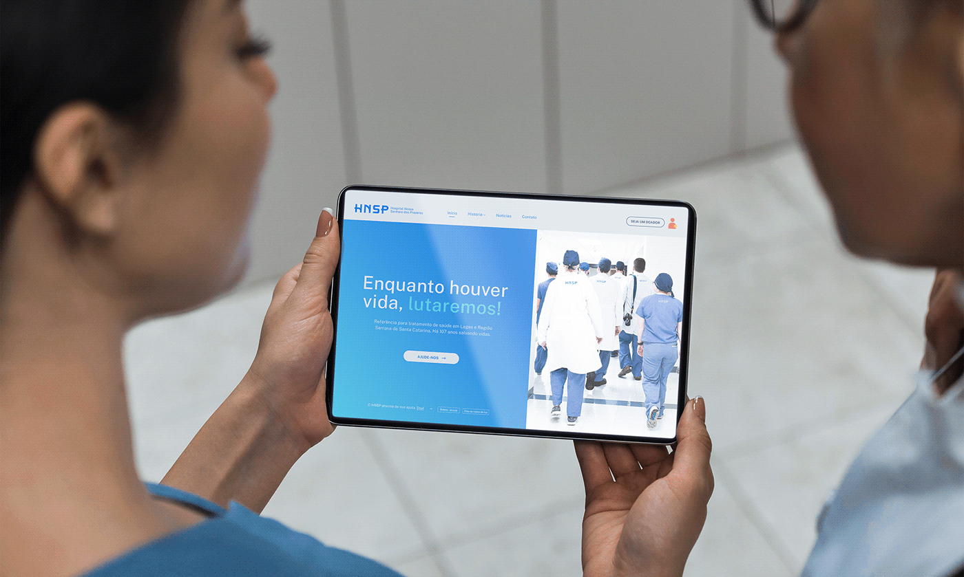
"We are a philanthropic hospital, and for over 107 years we have been saving lives".
“Somos um hospital filantrópico e há mais de 107 anos salvamos vidas”
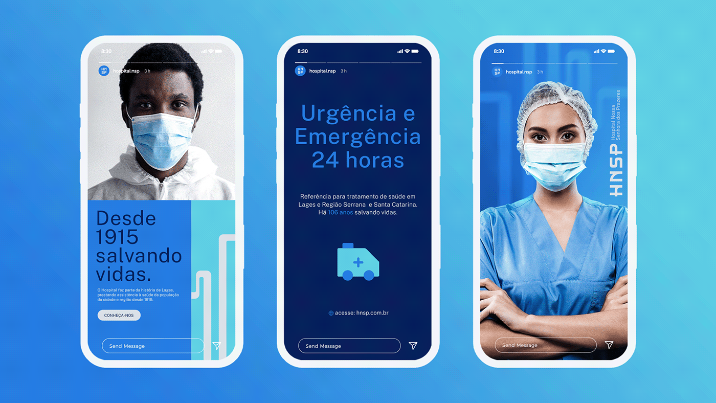
Lages and the Mountain Region. Attends urgencies and emergencies, in addition to several
specialties and references in traumato-orthopedics and neurosurgery.
The Hospital (HNSP) was officially created on November 19, 1915, by German nuns. That's why
the name represents a religious figure.
O Hospital Nossa Senhora dos Prazeres (HNSP), de Lages-SC, é um símbolo histórico da cidade e ao longo
deste período vem prestando grandes serviços no atendimento à saúde a toda a população de Lages e Região Serrana. Atende urgências e emergências, além de várias especialidades e as referências em traumato-ortopedia
e neurocirurgia.
O Hospital (HNSP) foi criado oficialmente em 19 de novembro de 1915, por freiras alemãs. Por isso do nome representar uma figura religiosa.


Para uma nova era, novos objetivos.
With this new digital and informational era, people are increasingly prioritizing to create opportunities for companies that are up-to-date and that transmit a positive image in regarding its positioning. Therefore, the objective of the project is directly linked to the growth and recognition that HNSP wants to have from now on.
Com essa nova era digital e informacional, as pessoas estão cada vez mais priorizando em oportunizar empresas que se atualizam e que transmitem uma imagem positiva em relação ao seu posicionamento. Por isso, o objetivo do projeto está diretamente ligado ao crescimento e reconhecimento que o HNSP deseja ter daqui pra frente.


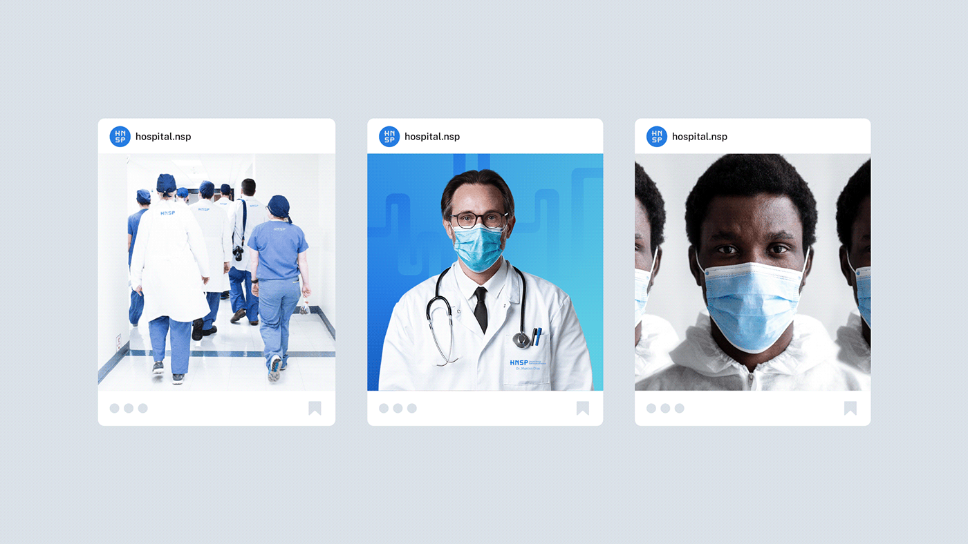
O visual e suas expressões.
A modern, flexible and attractive visual identity. We can see all these attributes in the choice of brand colors; colors like yellow and orange are not so common to see in the “hospital health” area. Running away from the conventional visual aspects of the segment was one of the right steps. The 100% typographic logo reinforces the idea of unity and welcome through the lines connected in the letters “H” and “P”.
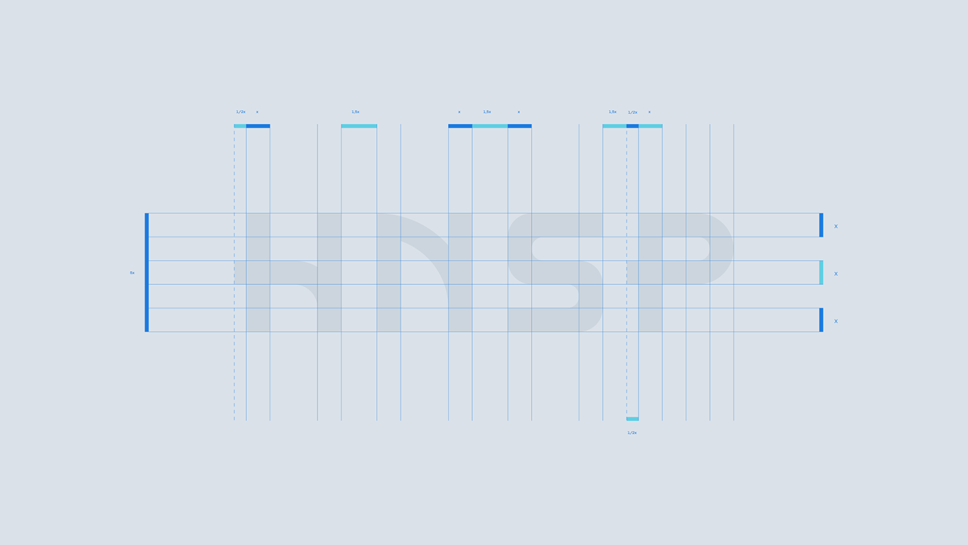
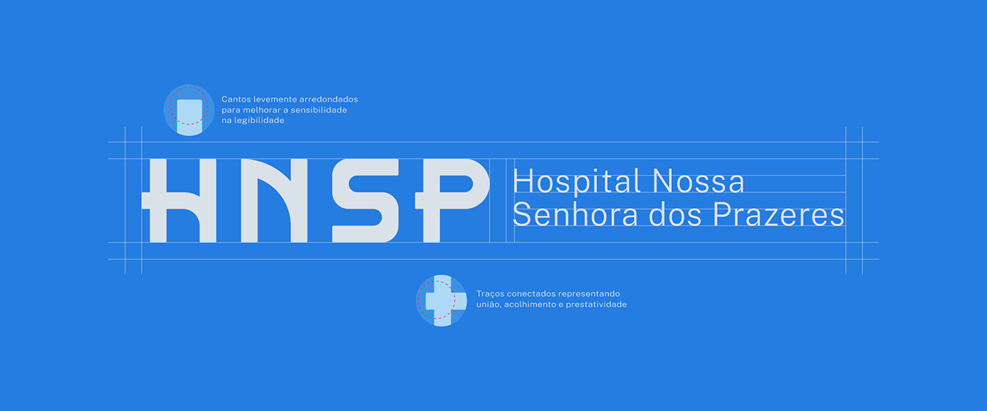
Uma identidade visual moderna, flexível e atraente. Podemos perceber todos estes atributos na escolha das cores da marca; cores como amarelo e laranja não são tão comuns de se ver na área da “saúde hospitalar”. Fugir dos aspectos visuais convencionais do segmento foi um dos passos acertado. O logotipo 100% tipográfico reforça a ideia de união e acolhimento através dos traços conectados diante as letras “H” e “P”.


Desafios, problemas e soluções.
Challenges: Our great challenge was to transform a historic and classic brand into a timeless brand that is attentive to new technological developments for possible adaptations, but without mischaracterizing its essence and true values.
Problem: The brand was transmitting what it no longer represented: a philanthropic brand that did not communicate attributes intrinsic to philanthropy (helpful, welcoming, empathetic, serious, etc). Furthermore, the context in which the brand was founded is totally different from current events and developments.
Solution: After diagnosing and clarifying the problems that the “HNSP” brand was facing, we had to reposition the brand through a “Rebranding”. We clearly defined a target audience, created a new value proposition, found the brand's purpose, created a new verbal message through the tagline and, finally, developed the hospital's entire visual identity.
Desafio: Nosso grande desafio foi transformar uma marca histórica e clássica em uma marca atemporal e atenta aos novos surgimentos tecnológicos, para possíveis adaptações, mas sem descaracterizar a sua essência e os seus verdadeiros valores.
Problema: A marca transmitia aquilo que ela não mais representava: uma marca filantrópica que não comunicava atributos intrínsecos a filantropia (prestativa, acolhedora, empática, séria, etc). Além disso, o contexto em que marca foi fundada é totalmente diferente dos acontecimentos e evoluções atuais.
Solução: Logo após diagnosticar e ter clareza sobre os problemas que o a marca “HNSP” estava enfrentando, tivemos que reposicionar a marca através de um “Rebranding”. Definimos com clareza o público-alvo, criamos uma nova proposta de valor, descobrimos o propósito da marca, criamos uma nova mensagem verbal através da tagline e, por fim, desenvolvemos toda a identidade visual do hospital.


Project: Strategy and Design, Designer: Luan Livero
Intermediation: CMLO&CO, Year: 2021
Thanks for the visit!


